Grid element is the basic and fundamental element in iBuilder. When you add any other element to the work area, the Grid is added by default if you didn’t place element into another Grid.
About Grid Element #
The Grid element in iBuilder is a powerful tool that allows you to create a grid-like layout for your webpage. It enables you to organize your content into separate sections, making it easier for users to navigate and understand your website. With the Grid element, you can create responsive designs that adjust to different screen sizes, ensuring that your website looks great on all devices.
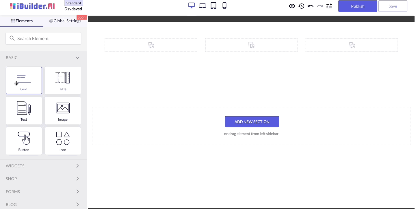
Add Grid #
To add a Grid element in iBuilder, you simply need to click on the “Elements” tab and select the “Grid” option from the list of available elements. Once you have added a Grid element, you can customize its properties, such as the background color, padding, and margins.
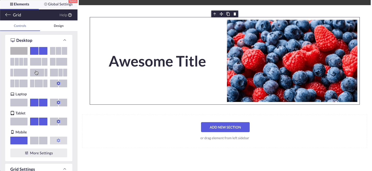
Choose corresponding Layout #
Consider the content: Before choosing a Grid layout, think about the type of content you will be adding to the Grid. Will you be adding text, images, videos, or a combination of these elements? Depending on the content, you may want to choose a layout that allows for larger or smaller sections, or one that provides more or less spacing between the elements.
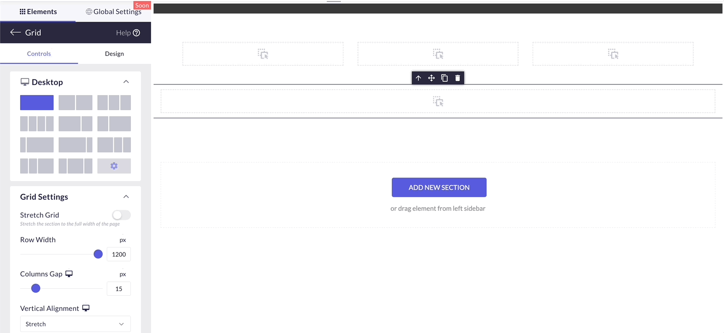
Full Width #
Toggle Stretch Grid switch on to make the Grid stretch to both edges of your page.
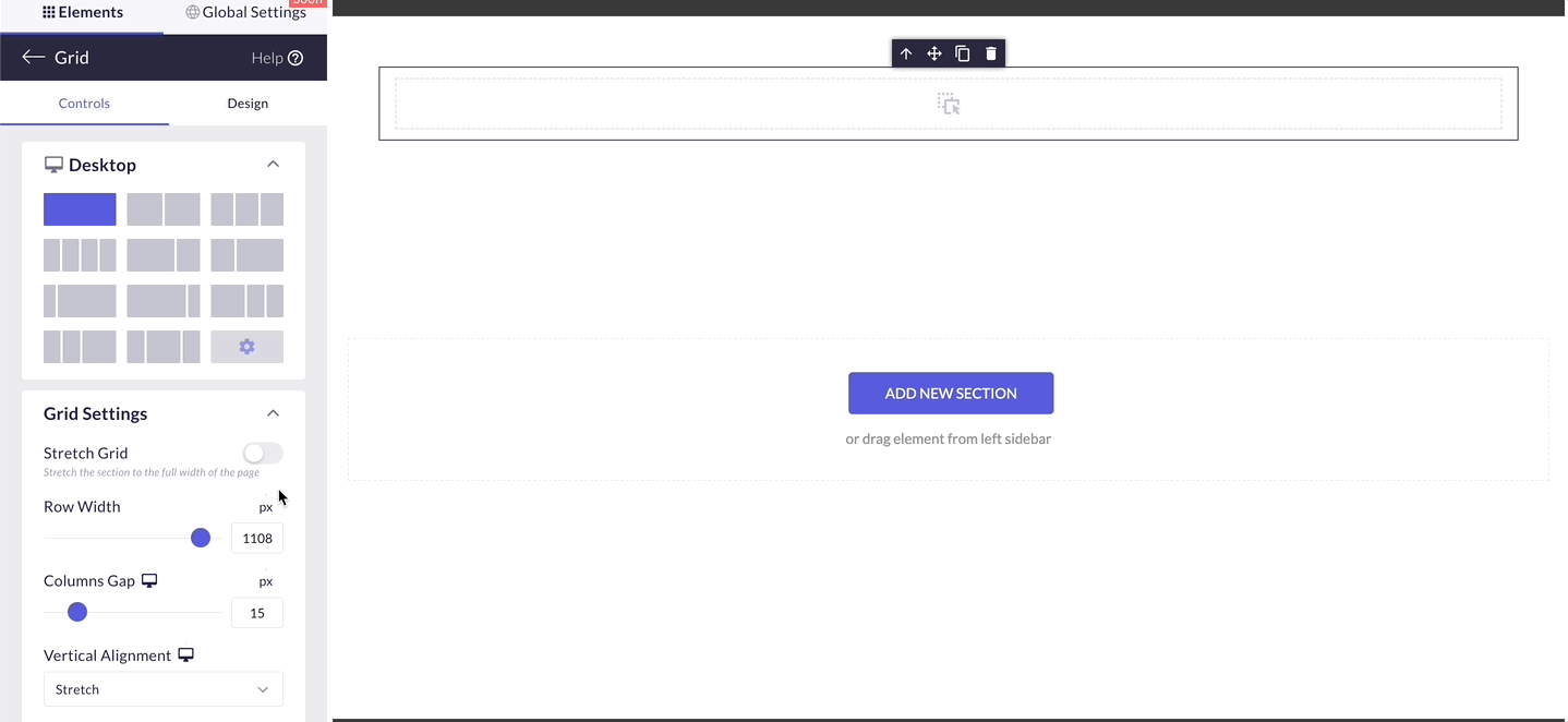
Columns Gap #
Use the slider or the number box to adjust the spacing between columns. This parameter won’t have any effect if you use a single-column layout.
Vertical Alignment #
You can change the position of your elements to Top, Bottom or Center. By default all elements inside Grid are centered.
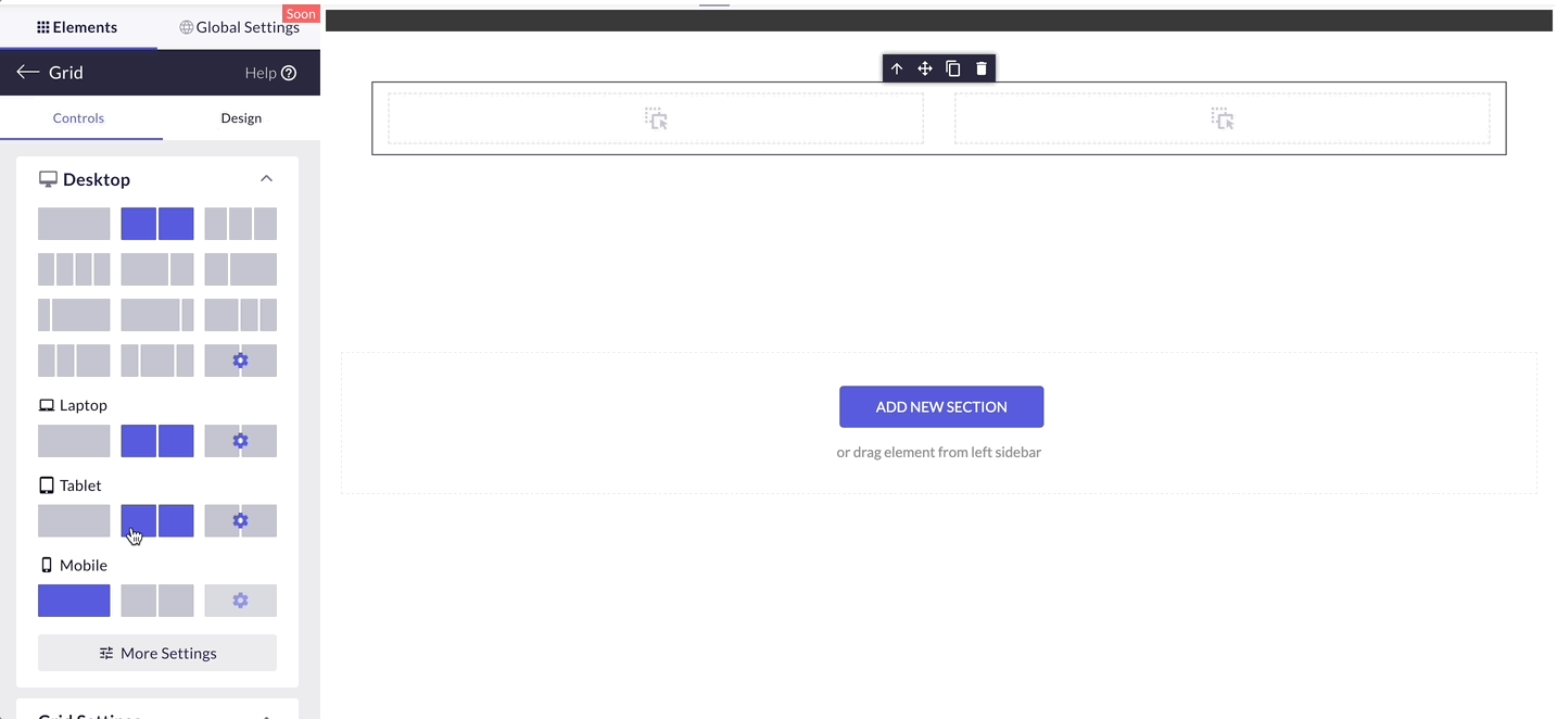
Reverse Columns #
Sometimes you need to change the order of Elements inside the Grid on mobile or tablet. By toggling Reverse Columns you can change the order from the right to left of mobile or tablet screens.

Don’t forget to hit “Save” and “Publish” once you are done with your page to make all the changes go live!